The Digital Listing Presentation (DLP) has long helped Ohmyhome users with property valuation and next steps, from booking an agent call to managing their home through HomerAI. This time, we reimagined the experience with a simple yet powerful vision: a seamless flow that better serves users and drives more property listings.
Problem:
How might we make the users list their property exclusively with Ohmyhome?
Solution:
We redesigned the DLP to cut down on time and confusion, creating a simpler flow that lets users list properties quickly with a clear agent support option when needed.
Our team had 2 months to reimagine DLP, so speed and focus were critical. After reviewing the requirements, I tapped into existing UI patterns and our design system to move faster for both design and development. This freed me to focus on what mattered most: building a flow that felt faster, clearer, and more supportive.
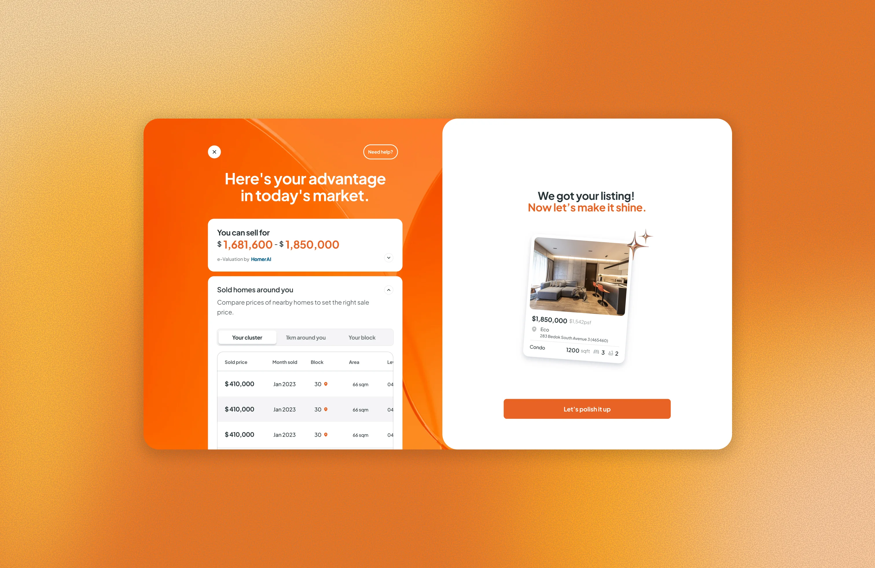
We created a proper doorway into DLP. Designed together with a senior designer and our product manager, the new entry point makes users instantly aware of where they’re headed. No second-guessing, just confidence from the start.
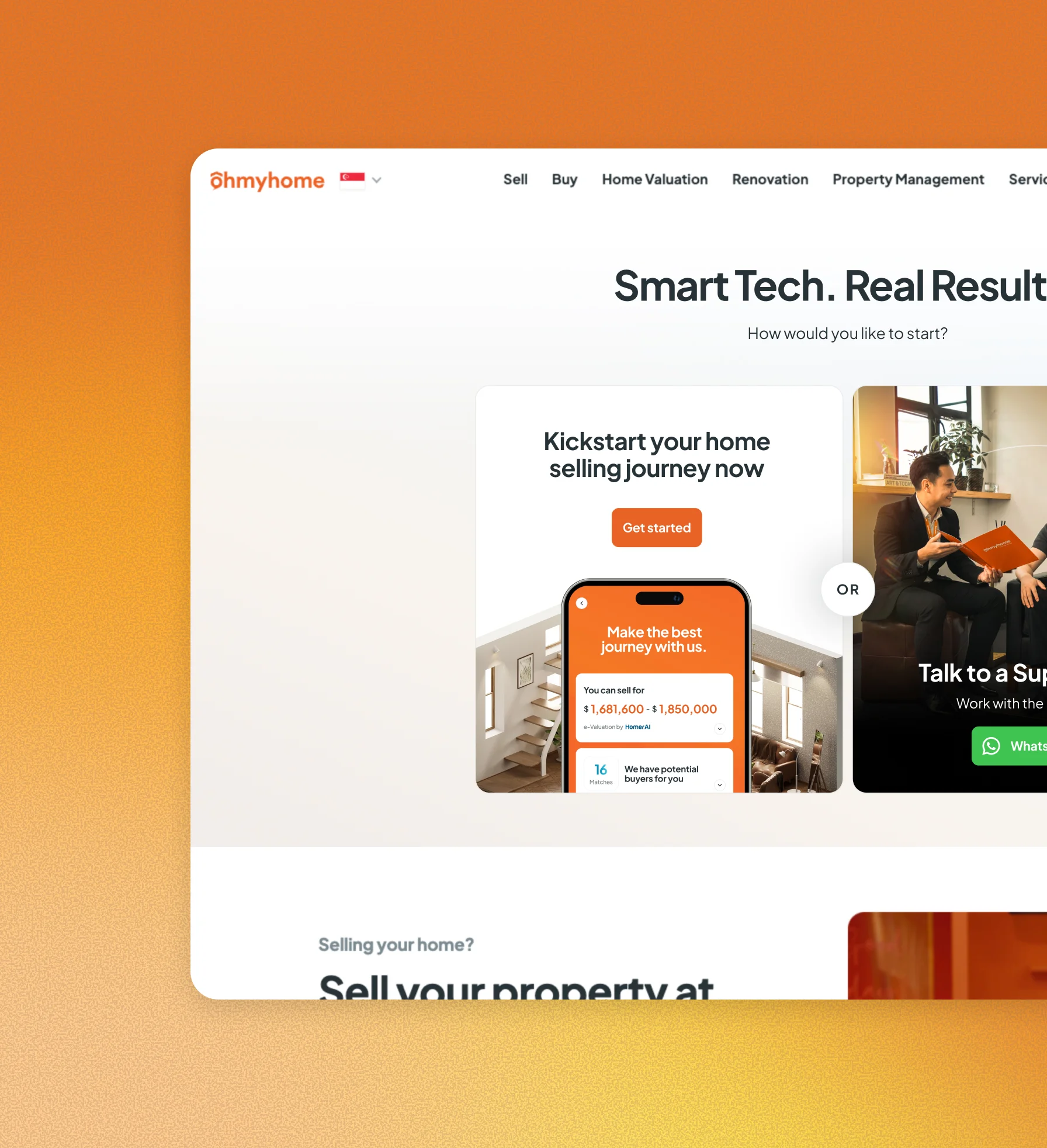
The journey is now linear, which makes listing faster and less overwhelming. By keeping the steps straightforward, we removed distractions and gave users a clear path to the finish line.
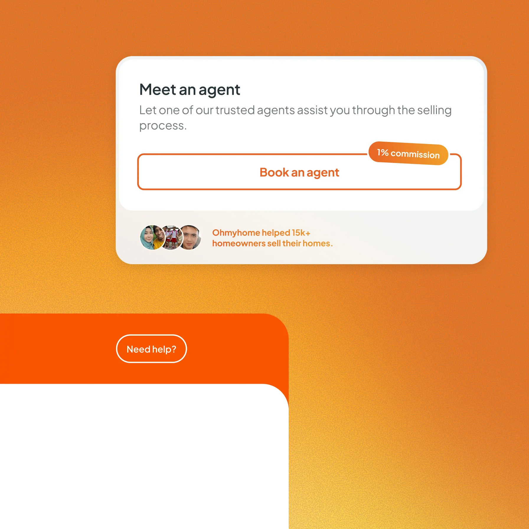
No one should feel stuck in the process. We added a “Get Help” button for quick questions and a “Book an Agent” option for those who want expert guidance. Help is always just a tap away.
After submitting their property, users can check their proceeds, calculate their next budget, and browse properties within their reach. Definitely a win for all!

You might be thinking, “The conversion rate looks lower, should we be worried?” It’s true, conversions are down to about 8 per 1,000 visitors. But here’s the difference: in the old flow, conversions were just booked calls with agents: low-commitment steps that didn’t guarantee a listing. The new flow is tougher but more meaningful, capturing sellers who complete full details and grant us exclusivity to list their property. We’re also seeing more average monthly leads overall, rising from 3,200 to 4,663. The flow has only been live for two months, so while results are early, the potential is strong.
If I had the chance to improve the flow, I’d focus on reducing friction in the funnel. A few areas stand out:

