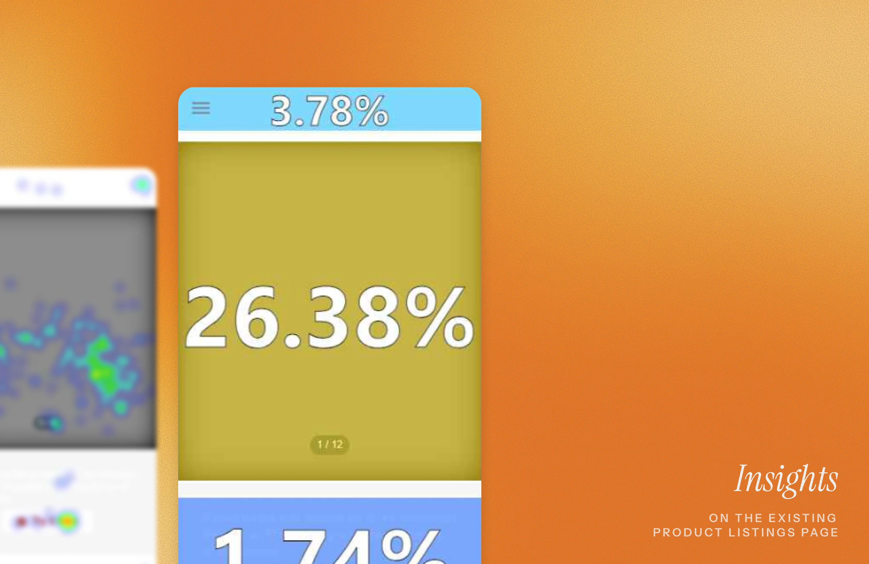
The listings page is where curiosity turns into action. With data in forms of heatmaps, interaction patterns, and user interviews, we set out to reimagine the experience. The goal was to craft a page that feels intuitive, inspires confidence, and drives more sales for Ohmyhome.
Problem:
How might we drive more users to interact with the listings page and generate more sales?
Solution:
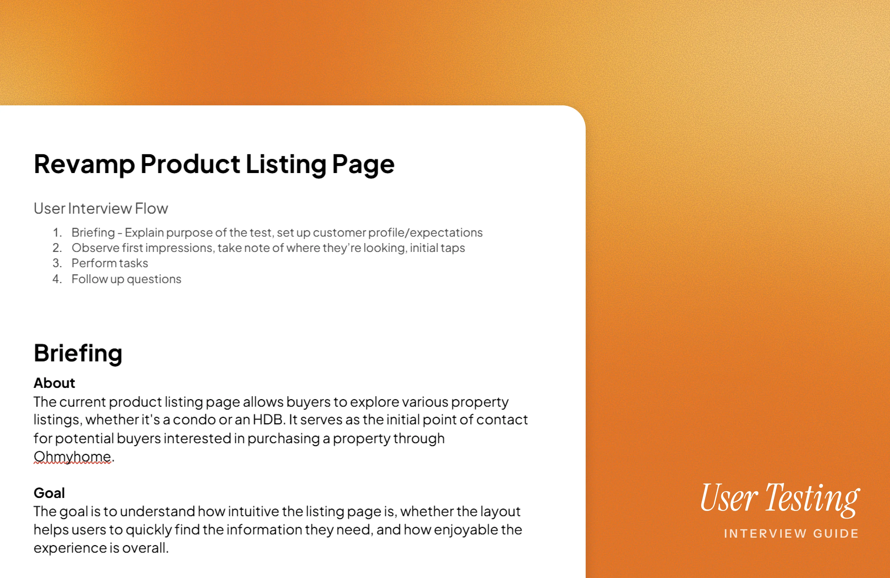
Building on the data, we designed the new product listings page and tested it through small-scale user interviews. Feedback from these sessions shaped the final design, resulting in a clearer, more engaging listings experience.
For this phase, I teamed up with my lead and another designer, who took charge of the first drafts. We started with heatmaps and data from the existing listings page, then reshuffled sections based on where users were actually spending their time.
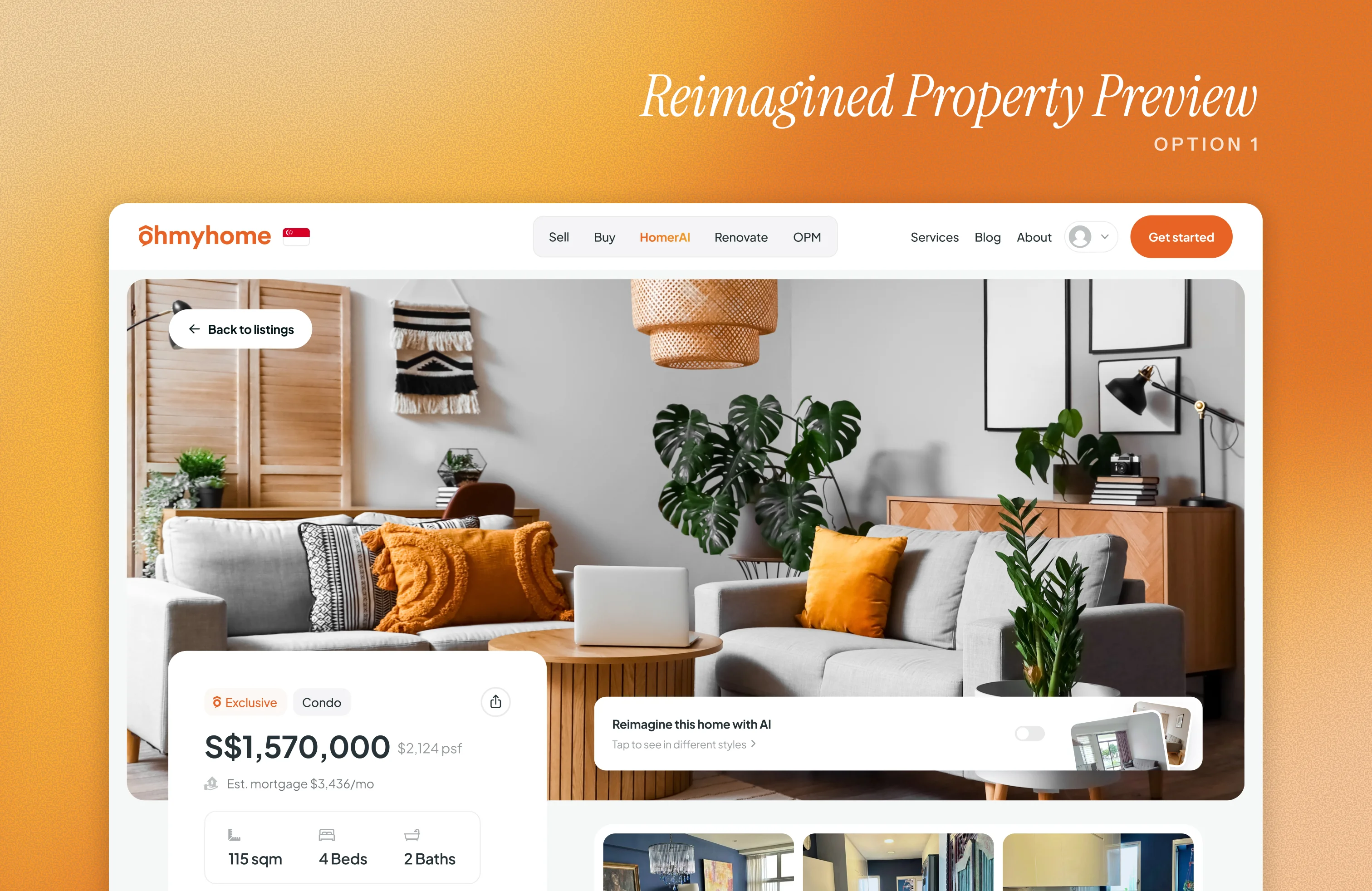
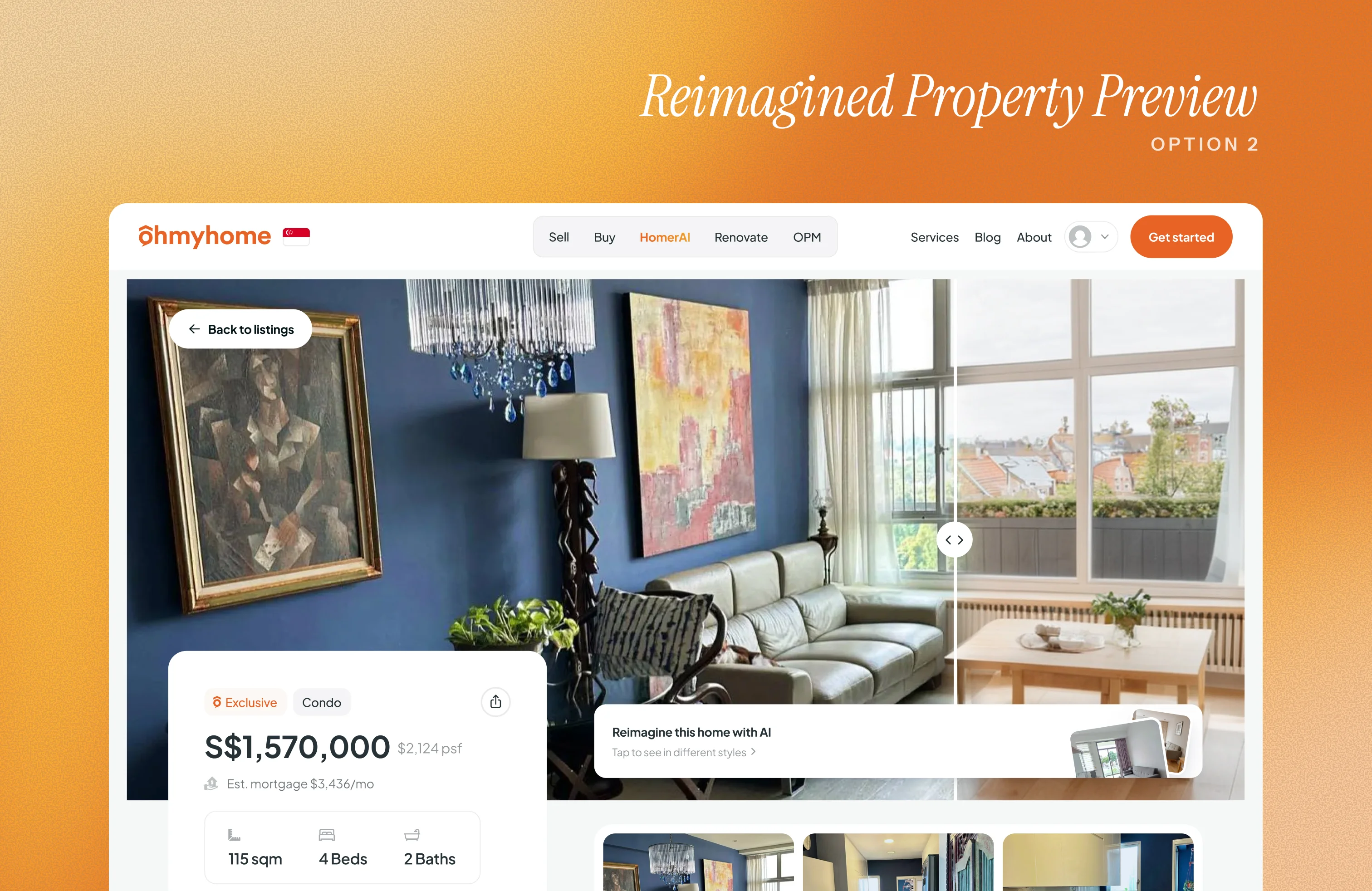
One big addition was an AI-powered feature that helps users imagine a property’s potential. They can explore how it might look after renovation and even try out different interior design styles.
We came up with two design directions:
Both designs were lined up for testing, not just to see which interaction worked better, but also to validate the new page layout.
For the next phase, we set up a small-scale user test to see how intuitive and enjoyable the new listing page designs were. Since this was a limited run, we had 8 participants here in the Philippines join a guided session. We began by explaining the purpose of the test and giving them a scenario to step into:
You’ve just started browsing for properties on Ohmyhome. You’re looking for a 4-bedroom condo in the city, within your set budget, and want to explore what’s available.
To keep things focused, we gave them specific tasks:
After showing the first version of the reimagined property preview, we asked them questions about their overall impressions, what they liked or disliked, how intuitive the navigation felt, whether they found the mortgage calculator useful, and what challenges or pain points they encountered.
Only after gathering this feedback did we introduce the second version of the reimagined property preview. Participants then rated both versions from 1 to 5, with 5 being the most satisfying experience.
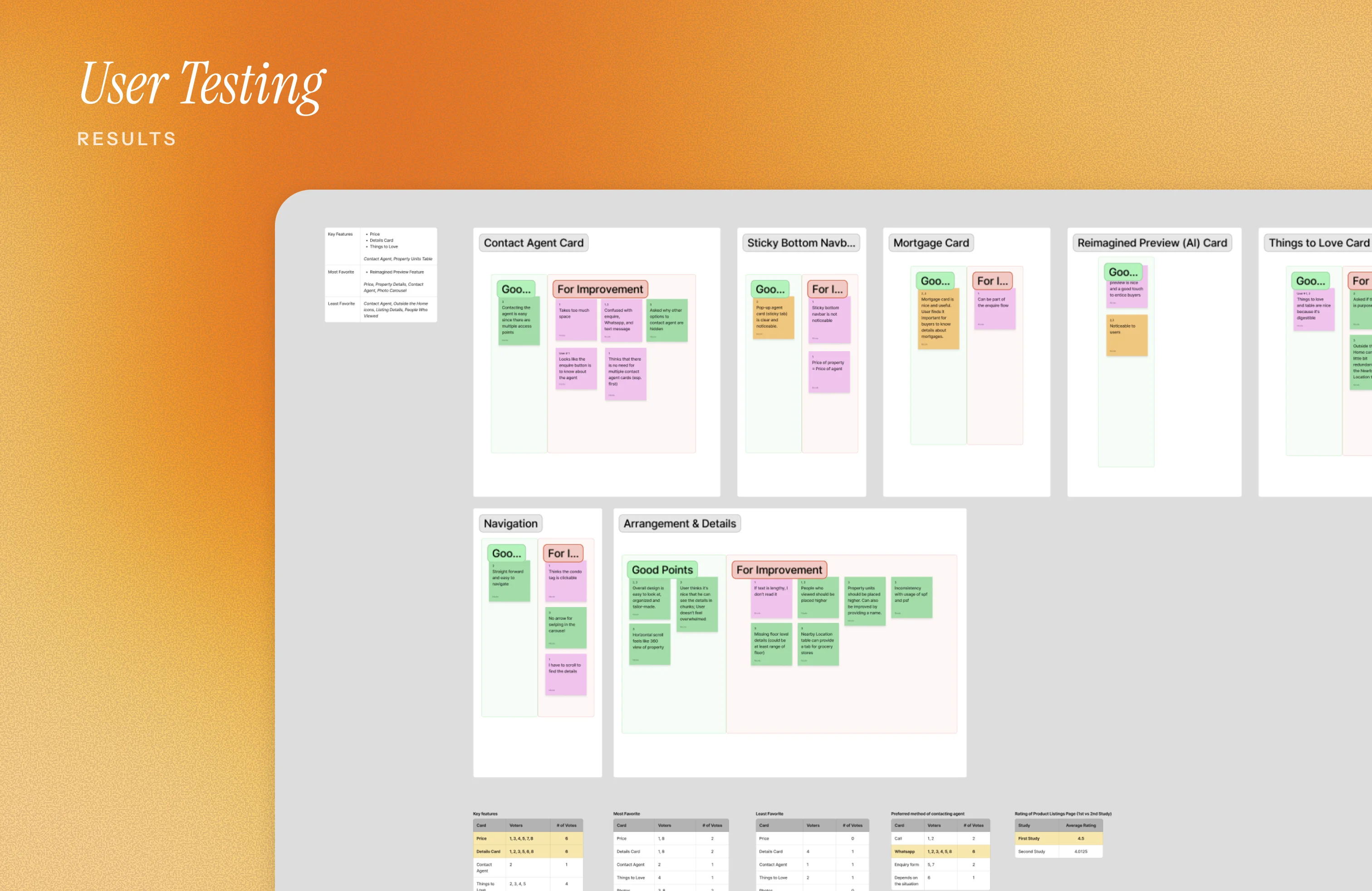
All of the responses were gathered via FigJam, placing each into sticky notes and grouping them by feature. Within each group, I split feedback into “positive points” and “for improvement.” This helped us see not just what worked well, but also where users struggled. It also gave us a clear way to prioritize based on which side had more weight.
I then presented the board to the team, walking them through what users thought of the new layout. The overall verdict was encouraging: testers felt the new design was a big step up from the current product listings page. Still, each feature, even the section arrangement, had areas for refinement.
From there, we assigned tasks for the revisions. Once updates were done, I pulled everything back together into the final layout that aligned with the testers’ preferences.
And with that, we arrived at the new and improved product listings page!
This project may be on hold, but if I were still part of the team, I’d push for a fresh round of user tests and interviews in Singapore, where the insights would be most valuable.

